
 For example,
in 6a-c:
For example,
in 6a-c:
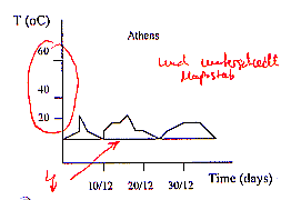
In two of the three graphs there is a horizontal line parallel to the x-axis. This is confusing. Is this a mistake or is it possible ( as some of our computer-cracks tend to believe) that your plotter left the pen down on the paper when returning to the origin?
It is also funny that the lines of the fractions and the numbers on the second axes are wrong. Our Math/Physics teacher would mark this in red if we did such a thing in a test!
Furthermore, in the lower graph, the numbers 1030 and 1040 (mbar) changed places.
Comparing the temperatures between Athens and Frankfurt (6 a), we were quite surprised. Then we realized that the graphs can not be compared at all, because the temperature-distributions on the second axes were completely different in each graph. Did someone want to pull our leg here?
For example, in 6 e-g:
A comparison of the temperatures between Athens and Frankfurt is impossible
in these two pictures, too, as now the time-distributions on the first
axes were completely different from each other. The straight line (of
Frankfurt) looks quite nice, but does not really say very much.
In 6g, it must have been the plotter again...
But apart from all this, the test was fun!
For the class 8c:
Ericson Hφlzchen, Christian Steil, Peter Wieduwilt.
(Comment on the graph: ... and in different scale...)
| << Previous Page |
|
